10/10
8. Aesthetic and Minimalist Design
Interfaces should not contain information that is irrelevant or rarely needed. Every extra unit of information in an interface competes with the relevant units of information and diminishes their relative visibility.

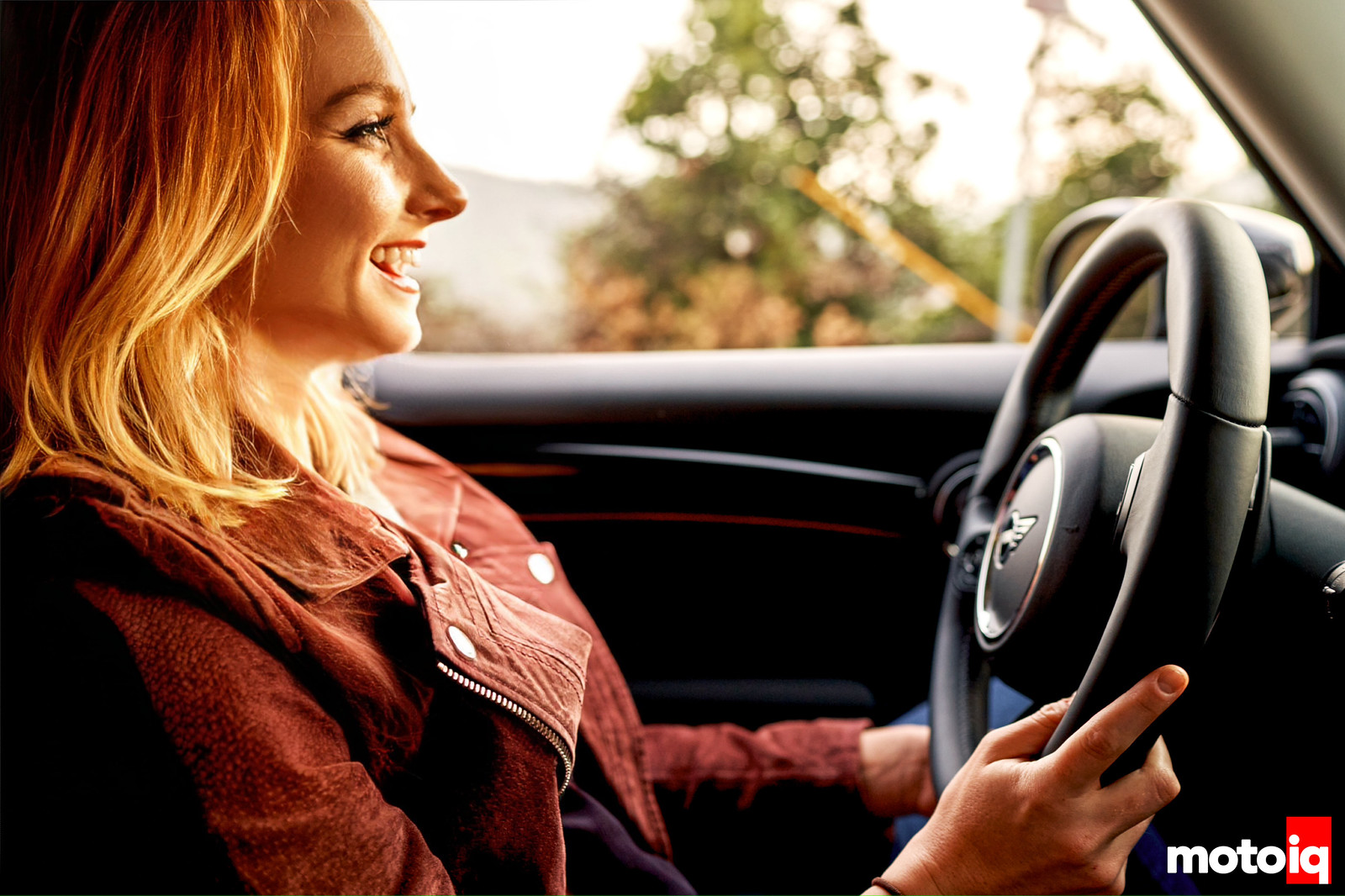
Where do I begin? MINI and icon in car absolutely KILLED the redesign here. The Mini’s all-black interior and exterior design add some serious edge to this otherwise toy-car image.
Oh, did I mention the dash has an underglow?

My favorite thing with this car is how exceptionally it uses color to communicate a whole onslaught of information…speed, RPM, temperature, volume, etc…all just on the colored ring that borders the 8-inch screen. To use something as simple as color to communicate so many things really hits the nail on the head in the aesthetic department, but in such a brilliant way to maximize the space.
10/10
9. Help Users Recognize, Diagnose, and Recover from Errors
Error messages should be expressed in plain language (no error codes), precisely indicate the problem, and constructively suggest a solution.
Eh, I’m ambivalent here. On one hand, there are certain aspects where the car really shines with this. PSI, Engine oil level and temp, and a few other mechanical bits and pieces are all communicated through the display with numerical levels and color indicators to alert the user whether or not this number is good or bad.
On the other hand, there’s the whole “I’m not really sure if I should change lanes now or not” thing I mentioned with #5…
All the detailed answers are provided in the digital Owner’s Manual (see #10), but when it comes to on-the-spot error prevention, I’d like to see some added text as a caption to accompany all these sounds and icons.


6 comments
“In essence, the shifting experience is literally in reverse order of what most cars have.”
If by that You mean shifting gears in manual mode, in essence ALL other cars are in reverse order compared to the sequential transmission shift pattern they are trying to emulate. In my experience, the BMW order is more enjoyable.
Think of it this way: if You are pushed in the seat by the 630hp Your BMW M5 CS puts to the ground, is it easier to select the next gear by trying to push your hand forward or just stay in position and pull the shifter back?
Also, drag cars have their brake parachute deploy by pulling the lever from back to front. Because race cars need to be intuitive. Why that hasn´t trickled down to passenger cars, I can not fathom.
Thank You for the article.
Lane Assist, Front Collission Assist etc messages in newer cars also make my blood boil.
Thanks for the tip! As for that sort of micro action determination with ideal shifting direction…I think it depends on a couple of factors:
1. What shifting experience has the driver already had? Are they new to driving, and if not, what driving background do they come from?
2. A/B testing. I’d imagine this difference in preference would take slivers off process timing, but again, it would have to be tested in order to determine what’s optimal.
Really, it depends on the driver’s current state and what we have to work with around that.
Glad to hear I’m not the only one who gets triggers by some of these notifications 😂
-Em
The shift pattern comes from motorsports. If you watch old school F1, WRC, and Indycar when they still had sequential shifters, pushing forward is to downshift and pulling back is to upshift. This pattern allows the motion to follow the current direction acceleration. Modern F1 cars pull like 5Gs on the brakes, but I figure the old school ones probably still pulled 2-3Gs on the brakes. Much easier to push forward on the shifter to downshift while braking than trying to pull back against 2-3G of force. Mazda and Porsche have the same motorsports biased shift pattern 🙂 It’s a similar situation on motorcycles. The street shift pattern is one down (to go from neutral to get into first gear) and five up to work up to 6th gear. This is all fine and good on the street and it’s easier to push down to get into first gear from neutral when getting ready to leave from a stop. But the motorsports shift pattern is one up, five down. So upshifts are completed by pushing down in the shift lever while accelerating and downshifts are executed by pulling up while braking. These directions of action align with the G forces the rider will be experiencing.
I don’t have specific comments on this Mini, but speaking as someone working on race car dash/interface stuff, I think your articles are going to provide a lot of interesting food for thought. I look forwards to more!
Thank you, Dan! That’s so kind. Definitely let me know if there’s anything specific you’d want to see in future articles…I love talking to other fellow dashboard nerds 🤓
In this immediate case I’m messing with AEM CD7 stuff for a pure race car, and essentially trying to think through how to set up the main screen to have it amplify the sort of information that gets checked more often or that should be called to attention while having lower priority stuff available to be checked when there’s more time.
… which largely ended up cribbing from the C7R GTE dash layout but I do prefer to do better educated ideas than “monkey see, monkey do” 😉